Welcome to my AS Media blog. Together we shall embark on the journey of my Media course. How wonderful!
Wednesday, 10 April 2013
Evaluation 6: What have you learnt about technologies from the process of constructing this product?
A video telling you what I learnt to do with the different technologies and what I learnt about them.
Evaluation 3: What kind of media institution might distribute your media product and why?
The media institution who would distribute my product would be IPC Media and WHSmiths. The reason why I think that these institutions would do this is because IPC distribute other magazines like mine, for example NME. I would also say that WHSmiths would too as they are very well known for having EVERY variety of magazine in their shop, and with so many mixed genres like mine, I think that they would distribute it from there.
Evaluation 2: How does your media product represent particular social groups?
The particular social groups that my media product represents are people who enjoy Rock/Indie/Alternative/Folk music.
The reason why these are the type of social groups that my product represents is because I was trying to represent those genres for the magazine in general.
The way that it shows these particular social groups is through images, text, colour and layout.
On the front cover, I have quite a large image of an artist who is wearing bright clothes and looks quite different and quirky. This is the way teenagers are if they listen to these genres.
Also, the fonts on the front are all very different and thats how it represents and brings in different types of people and different types of social groups.
Also, the text. The text in the article of my DPS is weird and wacky as some of the answers are funny to represent the social groups which are all my target audience age of 14-30 years old. An example of this is "Glastonbury Pyramid Stage. Every ticket sold... to one person... Tom Felton." This represents different social groups through humour.
The layout, is like a conventional Rock/Indie magazine and so it caters for those social groups.
Tuesday, 9 April 2013
DPS Final

The only difference that there is with this DPS to the last one is the font positioning underneath the title 'Chloe Lam'. This is a small change but it looks good and is easier to read.
Front Cover Final
We had to hand in our pages for our teachers to give us feedback on what we should change. Here are the changes.
As you can see, I only had three things I actually had to change; one of which was the bottom line which said 'AN EXCLUSIVE INTERVIEW WITH CHLOE' this was changed to be above the quote and to say 'CHLOE LAM REVEALS' as her name needed to stand out more on the page, this makes it seem a lot more professional.
The second and third changes were a to do with the font size, the words underneath 'Arctic Monkeys Interview' were too small and the words saying 'Inside look into Bombay Bicycle club's tour' was too big.
DPS final (sort of)
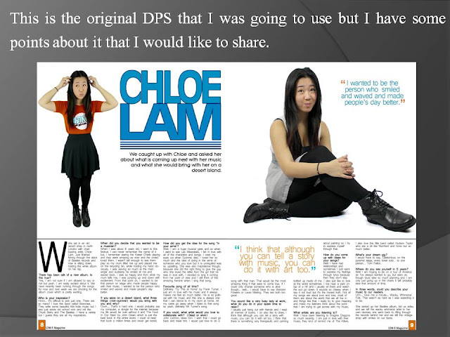
This is my DPS.
Like I said before, it needed changes, for example, the background. I decided to put these lines on it so that it would give it a arty kind of look and not look so plain and boring. The other thing that I did was make the background for the writing, grey. I think that this is also a much better change as the page doesn't look so bland but also, it isn't a colour which is too much e.g orange or blue.
Like I said before, it needed changes, for example, the background. I decided to put these lines on it so that it would give it a arty kind of look and not look so plain and boring. The other thing that I did was make the background for the writing, grey. I think that this is also a much better change as the page doesn't look so bland but also, it isn't a colour which is too much e.g orange or blue.
Contents page final
I really like my final contents page, it is simple but it also has a lot of things on it. It doesn’t become messy with its content.
I’ve kept the colour scheme consistent and although it took me a VERY LOOOOOOONG time to get the title ‘Inside’ right, I think that it looks great on the page and it looks better than it would have if it was black writing with a white outline.
The photos also really work with the whole page and bring it together to look like a real magazine.
The photos on my contents page.
I got a lot of people speculating about whether I had taken the photos on my contents page myself.
(The circled images are the ones that I was being asked about)
I wanted to make it clear that they are all my images so here are some more of them to show you.
Problems with InDesign
For our Double Page Spreads, we were advised to use the program called InDesign to make it however I had some problems with it.
The above image is of Photoshop and the one below is of InDesign. In InDesign, I could get the same font as the one above however, I could not to the effect of having darker blue lines outlining so it defines the text a bit more.
This means that I had to printscreen the font that I did on Photoshop and import the image to InDesign in order to have that particular type of font.
When I was uploading the images, I started to realise that they were coming out very blurry and pixellated. (You can see this is you click on the photo below.)
This didn't just happen to my photos but also to my font which I imported from Photoshop.
In conclusion, I decided not to use InDesign and stick with Photoshop.
The above image is of Photoshop and the one below is of InDesign. In InDesign, I could get the same font as the one above however, I could not to the effect of having darker blue lines outlining so it defines the text a bit more.
This means that I had to printscreen the font that I did on Photoshop and import the image to InDesign in order to have that particular type of font.
When I was uploading the images, I started to realise that they were coming out very blurry and pixellated. (You can see this is you click on the photo below.)
This didn't just happen to my photos but also to my font which I imported from Photoshop.
Contents Page Gone Wrong
When I first started doing my contents page, it looked like the photo below, I printscreened it while I was still working on it so that I could talk about my progress on the blog; however! The next time I tried to load the file onto Photoshop, it didn't work. This was due to the fact that I had not saved the file in the correct format.
Because of this very annoying fact, I had to restart the whole thing again. The photo below is of the finished product. You can see that there is a slight difference between the words 'INSIDE'. I actually think that the one on the final is so much better and neater than the image above.
Because of this very annoying fact, I had to restart the whole thing again. The photo below is of the finished product. You can see that there is a slight difference between the words 'INSIDE'. I actually think that the one on the final is so much better and neater than the image above.
Front Cover
This is my front cover of my magazine, I used picmonkey.com to edit the original image before I uploaded it onto Photoshop where I added my text. Like the silly person that I am, I didn't remember to take any screenshots until I had finished the actualcover.
It took me a while to do the fonts but I think that they look very nice and they work well together.
It took me a while to do the fonts but I think that they look very nice and they work well together.
Although I have finished my front cover now, it may need some tweaking later on.
Changing The Colours
(Quick thing to say that I am very sorry that I haven't updated)
Okay, that's done! Let's get on with the blog.
So I have been using Picmonkey.com to edit my photos for my magazine because it has better effects than Photoshop in my opinion. This helped me as when I asked my artist to come in to do the photo shoot, she didn't have any clothes that were orange or blue so I used Picmonkey to edit them so that they fitted in with my colour scheme.
Original Image:
Edited Image:
Subscribe to:
Comments (Atom)


